binary classification에서 best threshold를 찾고 roc-curve에 표시해보자
best threshold는 Youden’s J statistic를 이용한다.
참고: en.wikipedia.org/wiki/Youden%27s_J_statistic
Youden's J statistic - Wikipedia
From Wikipedia, the free encyclopedia Jump to navigation Jump to search Index that describes the performance of a dichotomous diagnostic test Youden's J statistic (also called Youden's index) is a single statistic that captures the performance of a dichoto
en.wikipedia.org
#1. best threshold 찾기
classifier modeling 후 best threshold에서의 sensitivity와 specificity를 확인한 후
classification reporting을 해보자
from numpy import sqrt
from numpy import argmax
from sklearn.metrics import classification_report
from sklearn.metrics import plot_roc_curve

#Youden’s J statistic. / J = Sensitivity + Specificity – 1
y_prob = model.predict_proba(X_test_features)
y_prob2 = y_prob[:,1]

# calculate roc curves
fpr, tpr, thresholds = roc_curve(y_test, y_prob2)
# get the best threshold
J = tpr - fpr
ix = argmax(J)
best_thresh = thresholds[ix]
print('Best Threshold=%f, sensitivity = %.3f, specificity = %.3f, J=%.3f' % (best_thresh, tpr[ix], 1-fpr[ix], J[ix]))

y_prob_pred = (model.predict_proba(X_test_features)[:,1] >= best_thresh).astype(bool)
print(classification_report(y_test, y_prob_pred, target_names=['normal', 'abnormal']))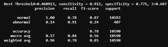
#2. roc-curve에 threshold 표시하기
#plot roc and best threshold
sens, spec = tpr[ix], 1-fpr[ix]
# plot the roc curve for the model
plt.plot([0,1], [0,1], linestyle='--', markersize=0.01, color='black')
plt.plot(fpr, tpr, marker='.', color='black', markersize=0.05, label="XGBClassifier AUC = %.2f" % roc_auc_score(y_test, y_prob2))
plt.scatter(fpr[ix], tpr[ix], marker='+', s=100, color='r',
            label='Best threshold = %.3f, \nSensitivity = %.3f, \nSpecificity = %.3f' % (best_thresh, sens, spec))

# axis labels
plt.xlabel('False Positive Rate')
plt.ylabel('True Positive Rate')
plt.legend(loc=4)

# show the plot
plt.show()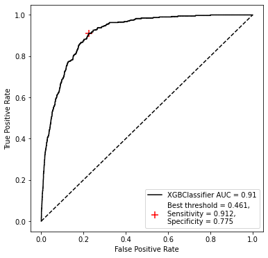
참고 : machinelearningmastery.com/threshold-moving-for-imbalanced-classification/
A Gentle Introduction to Threshold-Moving for Imbalanced Classification
Classification predictive modeling typically involves predicting a class label. Nevertheless, many machine learning algorithms are capable of predicting a probability or scoring of class membership, and this must be interpreted before it can be mapped to a
machinelearningmastery.com


